I decided that even if i cleaned up the animation and re-designed the silhouettes to look more realistic that this just isn't the banner i want to make.
Problems with the First Banner
-Firstly, the silhouettes just look terrible.
-The "firework" is embarrassing
-When the couple extend their arms to hold hands, their arms look suspiciously like something else, i won't say what.
-Even with a lot of motion tweening on about 6 different parts of the silhouettes, it still looks tacky.
New Banner
The banner is going to advertise a new fizzy drink I've made up, called 'Drift Soda'.
The banner will start with an explosion of colour and the can appearing, I'm going to use a series of frames with different levels of half-tone colour. This is really difficult to explain so just have a look at my "pilot" banner here
After this, I'll have the text "DRIFT SODA....PACKS A PUNCH" appear (see the "pilot"). When "PACKS A PUNCH" appears, a fist will come from the background and gradually get bigger behind the text (to give the illusion of it approaching and getting closer).
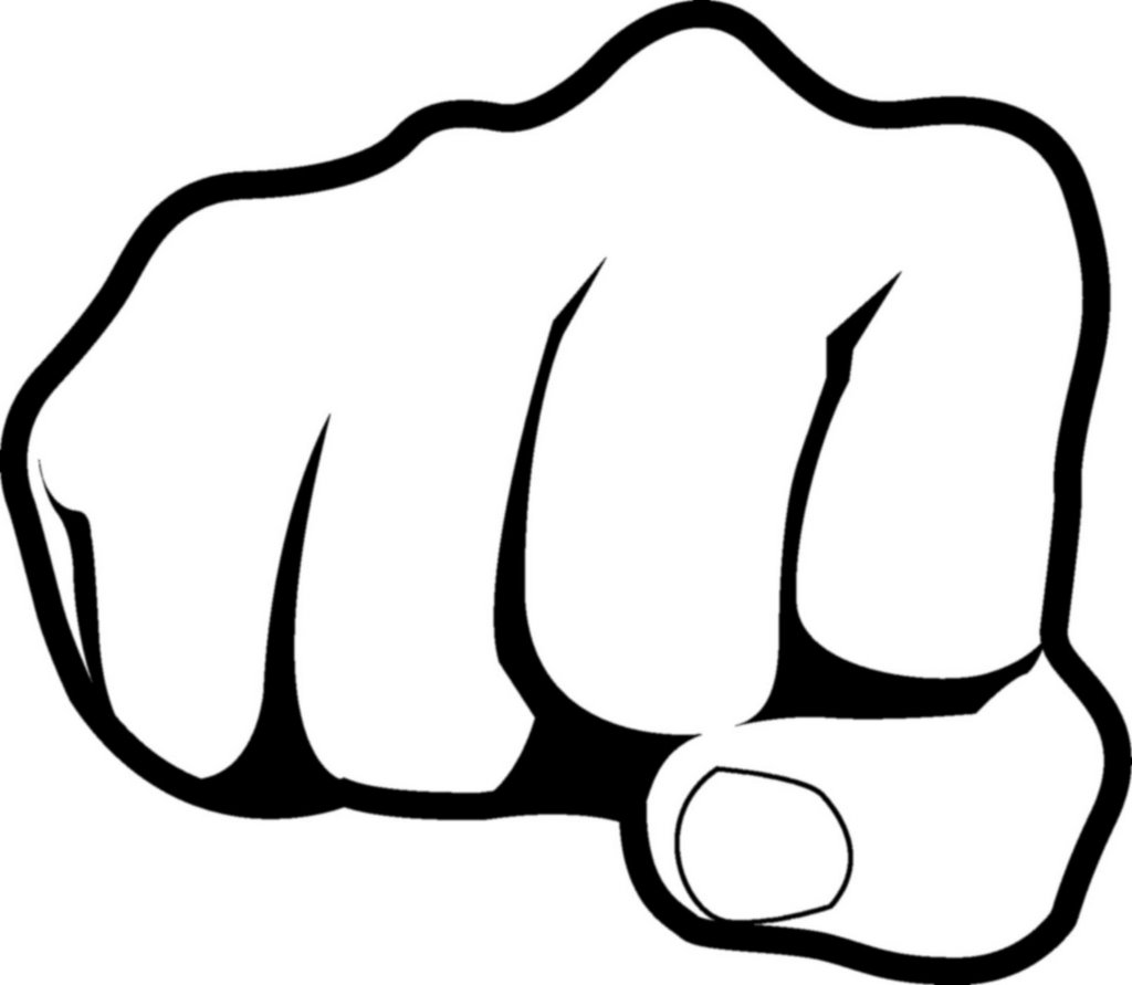
When the fist reaches it's maximum size - I'm going to have the text scatter. I'm hoping this will look like the text has literally been smacked off the page
No comments:
Post a Comment